Global Accreditation Body for OKR Certifications
- Purpose: A visual and real-time display of OKR progress, typically used in tracking systems or software.
- Audience: Teams, leadership, and any stakeholders who want quick, up-to-date progress information.
-
Content:
- Progress Bar/Graph: Visual indicators of the progress of each key result (percentage completion, timelines, etc.).
- Status Indicators: Color-coded icons or charts (e.g., green, yellow, red) to show how close each key result is to completion.
- Trends Over Time: Charts or graphs that show progress over weeks or months, providing insights into how progress is evolving.
- Summary Statistics: Quick stats such as the percentage of OKRs on track, overdue, or at risk.
Example:
-
Objective: Improve employee engagement
- KR1: Increase employee satisfaction score by 15% → 10% achieved (Yellow)
- KR2: Implement 3 new employee wellness initiatives → 2 implemented (Green)
- KR3: Increase internal promotion rate by 20% → 18% achieved (Yellow)
Figures 5.6 shows Dashboard reports used in OKR implementations:
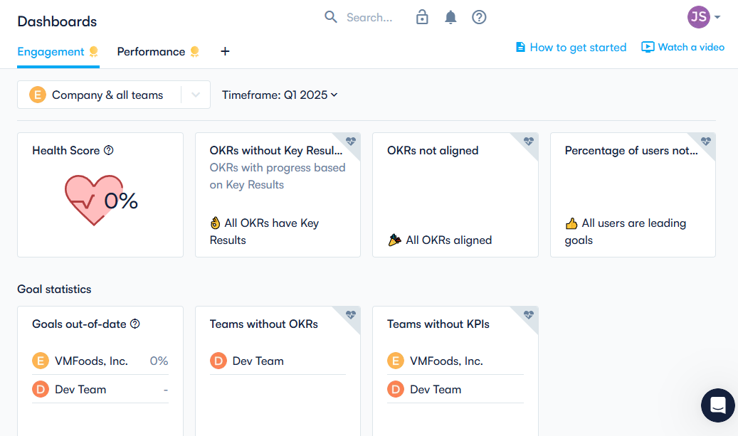
Figure 5.6: Dashboard Report (Source: Perdoo)
Figure 5.6 depicts a Dashboard Report displaying objective health, current progress rates, and insights on top-level and departmental goals using progress bars and color-coded indicators.